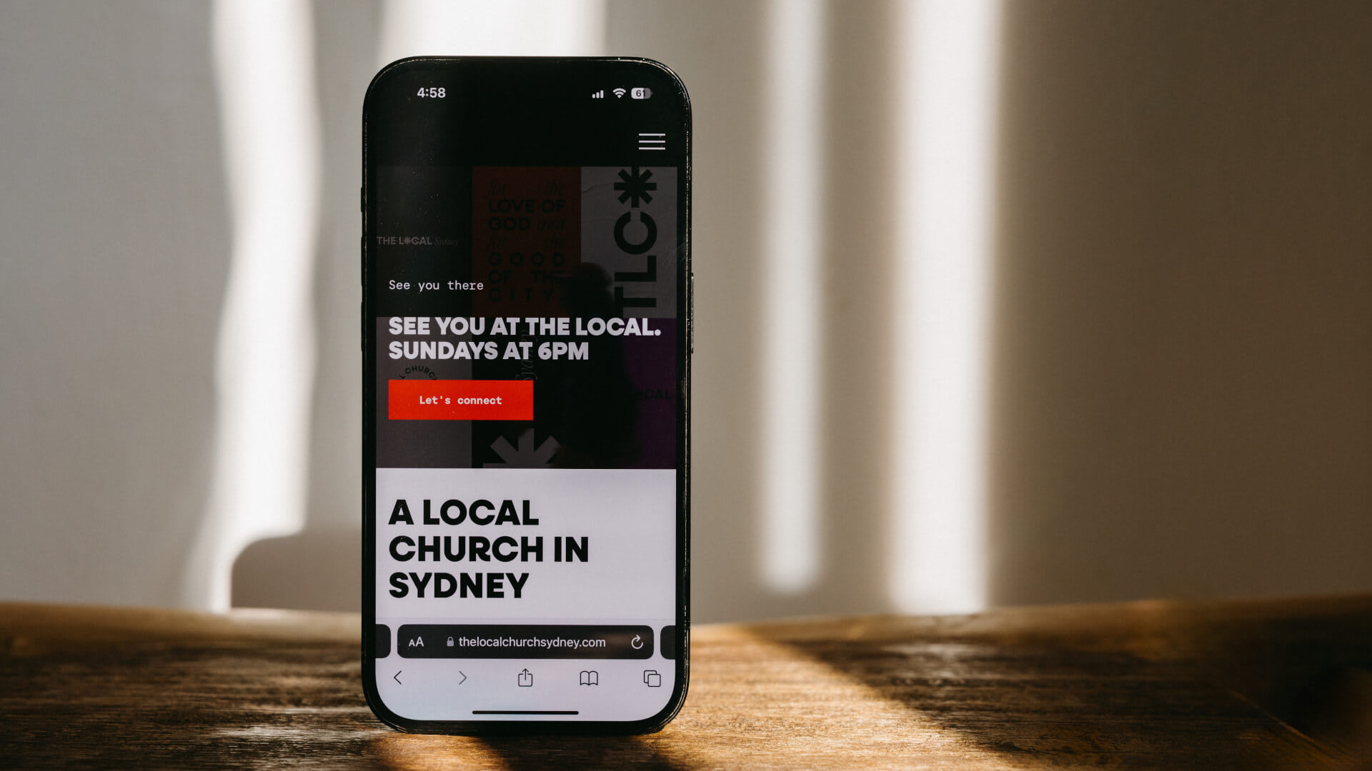
What is a call-to-action?
A call-to-action (CTA) is just fancy marketing language for an element on a webpage that prompts visitors to take a specific action. It’s often in the form of a button or a link.
Why do call-to-actions matter?
Effective CTAs are essential for a church website as they guide people toward meaningful engagement and participation. A good CTA can help eliminate confusion by providing clear instructions on what action a person can take, such as attending a service, signing up for an event, or joining a group. Without prominent CTAs, a church website may only serve as an informational brochure, failing to inspire people to take valuable action.
3 call-to-action mistakes to avoid
We’re human; we all make mistakes. Whether you call them mistakes or just spontaneous creative decisions, steering clear of these 3 can be essential for crafting effective CTAs.
1. Overloading Pages with Multiple CTAs
Presenting too many CTAs on a single page can overwhelm visitors, making it difficult for them to decide which action to take. It’s best to focus on one primary CTA per page. While certain pages, like the homepage, may require multiple CTAs to cater to different audiences, ensure that the main CTA stands out visually.
2. Poor Placement of CTAs
CTAs in hard-to-find spots, like far down the page or hidden in content, receive fewer clicks. Position them in prominent locations, such as above the fold or at the end of content sections, where users naturally look for them. On long pages, you can place the same CTA in multiple areas of the page to increase visibility.
3. Poor Mobile Optimization
With a significant amount of web traffic coming from mobile devices, failing to optimize CTAs for mobile users can lead to missed opportunities. Design CTAs to be easily clickable and visible on smaller screens. Make sure to use colors that stand out against the background and other elements on the page.

