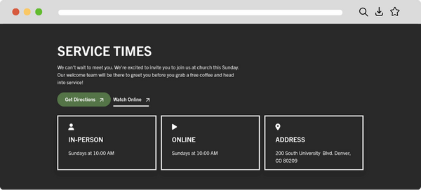
Finding service times on your church website shouldn’t feel like searching for a parking spot on Easter Sunday. Discover how white space can draw attention to key details, making it easier for visitors to find what they need and take the next step.
What is white space?
White space, sometimes called negative space, is the empty area around and between design elements like text, images, and buttons. It doesn’t have to be white—it can be any color or pattern. Think of it as the “breathing room” that organizes the design and helps each element stand out, such as the gaps between paragraphs, margins, and navigation links.
Why is white space important?
White space helps visitors quickly find what matters most on your church website. By giving important details like service times, contact info, and event announcements room to breathe, white space prevents the site from feeling cluttered or overwhelming. This clarity makes it easier for visitors to scan the page, absorb information, and take the next step, whether that’s clicking a button or reaching out for more info.
How do I use white space?
Using white space on a church website involves creating a clean, uncluttered layout that guides visitors’ eyes to the most important information. Start by giving plenty of breathing room to headlines, service times, and call-to-action buttons. Continue to adjust typography for readability, group related content together, and separate unrelated sections. A clean, uncluttered layout not only looks better but also helps visitors easily find what they need.